> For the complete documentation index, see [llms.txt](https://document.tek-labs.app/free-gift-userguide/llms.txt). Markdown versions of documentation pages are available by appending `.md` to page URLs; this page is available as [Markdown](https://document.tek-labs.app/free-gift-userguide/user-guides/styling/product-bundle-type.md).
# Product bundle
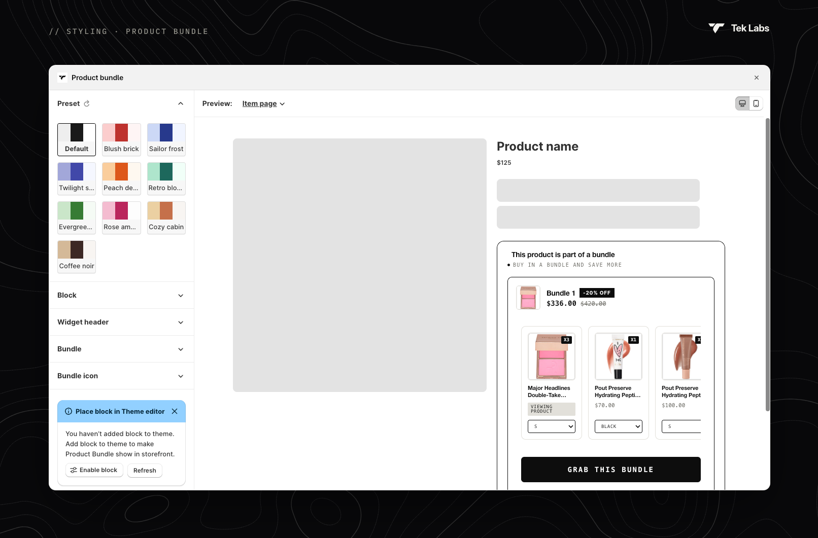
Style the product bundle block.
**Preview**: choose **Item page** (the block on a product included in the bundle) or **Bundle page** (the block on the bundle product's own page). Use the Desktop and Mobile icons to switch devices.
## Sections
| Section | Settings |
| ---------------------- | ---------------------------------------------------------------------------------------------------------------------------------------------------------------------------- |
| **Preset** | **Default**, **Blush brick**, **Sailor frost**, **Twilight sky**, **Peach delight**, **Retro bloom**, **Evergreen mist**, **Rose amber**, **Cozy cabin** or **Coffee noir**. |
| **Block** | Font family, background and border colours, border radius and width. |
| **Widget header** | Bundle title and subtitle: colour, size and weight; subtitle background; active dot colour. |
| **Bundle** | Border colour (and when chosen), border radius and width, image radius and size. |
| **Bundle icon** | Icon colour, background and size, or **Upload icon**. |
| **Discount badge** | Badge background, border and text colours, size and weight. |
| **Product section** | Section and item card backgrounds, card border, radius and width; product title, price and quantity styles; "Viewing product" text and tag colours. |
| **Image** | Image border radius and size. |
| **Bundle price** | Discounted price and regular price: colour, size and weight. |
| **Bundle page widget** | Bundle page only: "items included" and item-count texts, footer background and total text. |
| **Button** | Text size, weight and colour; button background. |
| **Custom CSS** | Your own CSS. |
| **Widget placement** | **Change widget position** in the theme editor, or copy the code snippet ``. |