> For the complete documentation index, see [llms.txt](https://document.tek-labs.app/free-gift-userguide/llms.txt). Markdown versions of documentation pages are available by appending `.md` to page URLs; this page is available as [Markdown](https://document.tek-labs.app/free-gift-userguide/user-guides/styling.md).
# Styling
Make every widget match your store's brand.
Open **Styling** in the app menu, or **More actions › Edit widget style** from any offer.
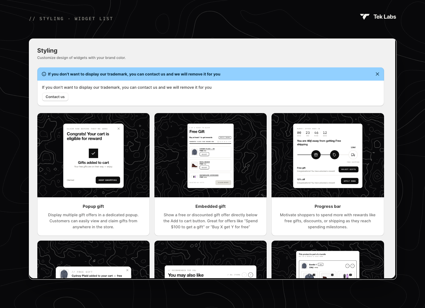
Each card opens the style editor for one widget:
| Widget | What it is |
| --------------------------------------------------------------------------------------------------------------------------- | ------------------------------------------------------------------------ |
| [Popup gift](/free-gift-userguide/user-guides/styling/popup-gift-type.md) | A popup where customers view and claim gifts from anywhere in the store. |
| [Embedded gift](/free-gift-userguide/user-guides/styling/embedded-gift-type.md) | A gift block below the **Add to cart** button on the product page. |
| [Gift In Cart](/free-gift-userguide/user-guides/styling/gift-in-cart-type.md) | A gift block inside the cart page or cart drawer. |
| [Progress bar](/free-gift-userguide/user-guides/styling/progress-bar-type.md) | The milestone bar for Progress bar offers. |
| [Notifications](/free-gift-userguide/user-guides/styling/notification-type.md) | A small message when a free or discounted item is added to the cart. |
| [Product Selector](/free-gift-userguide/user-guides/styling/product-selector-type.md) | The You May Also Like recommendations. |
| [Product bundle](/free-gift-userguide/user-guides/styling/product-bundle-type.md) | The bundle block for Product bundle offers. |
| [Volume discount](/free-gift-userguide/user-guides/styling/volume-discount-type.md) | The tier block for Volume discount offers. |
| [Today Offers](/free-gift-userguide/user-guides/styling/today-offers-type.md) | A side tab that lists the store's active offers. |
| [Floating Button & Notification Modal](/free-gift-userguide/user-guides/styling/floating-button-notification-modal-type.md) | A floating button and popup that show a gift discount code. |
| [Discount Box & Gift Slider](/free-gift-userguide/user-guides/styling/discount-box-gift-slider-type.md) | The code box and gift selector for Gift discount code offers. |
## The style editor
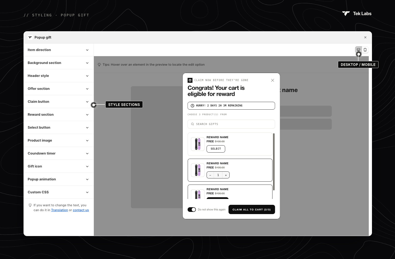
Style sections on the left, live preview on the right
* **Style sections** (left): click a section to expand it. Expanded sections show a **↺** icon to reset that section to its defaults.
* **Live preview** (right): switch between **Desktop** and **Mobile** with the icons in the top-right corner. Many widgets also have **Preview** drop-downs to see each state, for example *Manually choose gift* and *Not eligible yet*.
* **Hover to locate**: hover over any element in the preview to find the setting that controls it.
* **Save / Discard**: Shopify's save bar appears when you make a change.
### Common settings
* **Preset**: one-click colour themes (Progress bar, Notifications, Product bundle, Volume discount, Floating button). Choose **Custom color** to pick your own.
* **Font family**: **Helvetica Neue** or your **Store theme font**.
* Colour, size (px), weight (**Normal**, **Semi-bold**, **Bold**), border, radius and padding controls in each section.
* **Custom CSS**: add your own CSS. Don't hesitate to contact us; we'll set it up for you.
* **Widget placement** (Embedded gift, Product bundle, Volume discount, Product Selector): **Change widget position** opens the theme editor, and a **Code snippet** lets you place the widget anywhere in your theme code.
{% hint style="info" %}
To change the **text** of a widget, use [Translations](/free-gift-userguide/user-guides/translation.md). The tip at the bottom of each editor links there.
{% endhint %}
### Banners in the editor
* **Place block in Theme editor**: the widget's app embed is off. Click **Enable block**, save in the theme editor, then click **Refresh**.
* **New … design available**: your widget still uses an older design. Click **Use new UI** to switch. This replaces the widget's styling with the new defaults when you save; your translations stay unchanged.
* **If you don't want to display our trademark, you can contact us and we will remove it for you.**
{% hint style="warning" %}
The **Popup old version** and **BOGO** styles no longer exist. BOGO offers now use the [Popup gift](/free-gift-userguide/user-guides/styling/popup-gift-type.md) and [Embedded gift](/free-gift-userguide/user-guides/styling/embedded-gift-type.md) widgets.
{% endhint %}